Within ServiceNow, the platform's chatbot module, Virtual Agent, is my happy place. I love a good chatbot experience and Virtual Agent has all the elements to make that happen.
Bots are an increasingly import self-service channel for both employee and customer interactions. If they’re done well, they’re a win-win – an easy and effective tool for users and a cost-effective support mechanism for the enterprise.
VA can perform a wide range of tasks including answering FAQs or directing users to knowledge articles, providing case statuses or incidents updates, gathering data before a user is transferred to a live agent, performing diagnostics, and even resolving multi-step problems.
All the attributes are there to deliver a great experience. VA is robust, versatile, has good aesthetic potential and can be easily rolled out across numerous channels. But the out-of-the-box solution needs to be finessed if it’s to provide the quality standard users expect these days.
It’s easy for the VA experience to fall flat and backfire. If the UX (user experience) is poor, the target audience will be left with a negative impression and won’t be receptive to using the platform again.
Let me show you what I mean. First of all, it’s incredibly easy to get VA up and running.
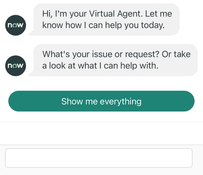
This is literally VA out of the box. Well, okay, not literally; there are no actual boxes involved. But all I did to get to this point was activate the required VA plugins along with some of the OOB topics (conversations) designed for HRSD (ServiceNow’s human resources module). I also enabled VA for mobile and linked the Now mobile app to my PDI (personal developer instance).
As you can see, the options at this point are to either tap the button or enter a text response. Let’s keep it simple for now by tapping ‘Show me everything’ which brings up the list of all active topics. You’ll see they’re labelled ‘(Template)’ to indicate they are, indeed, unedited OOB template versions of the topics.
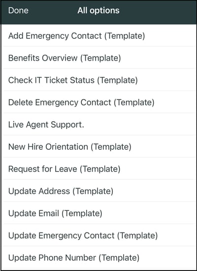
My PDI already has my wife’s information as my emergency contact, so let’s update her contact details.
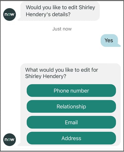
Let’s edit the phone number …
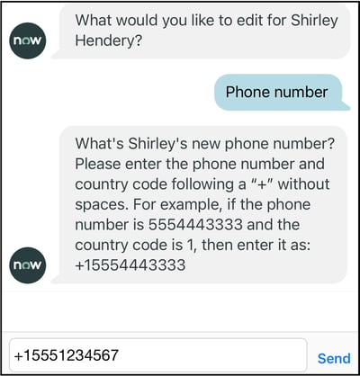
Okay, that’s fine but it’s not super user-friendly. We’re forced to enter a value that satisfies a certain ServiceNow field type, namely an E164-compliant string beginning with a ‘+’. If a leading consumer bot made us do this, we’d probably be left a bit underwhelmed by the experience.
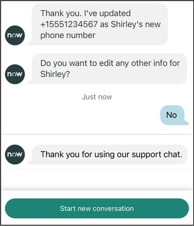
So there we have it. We’ve completed an interaction that’s been functional but hasn’t really delivered the wow factor. And that’s fine given we’ve spent zero effort so far tweaking the OOB set-up.
At the end of the day, ServiceNow's Virtual Agent is all about starting with a technically and functionally brilliant platform and customizing it to enable a user experience that’s tailored to an organization’s specific requirements. This walk-through has highlighted an example of what it’s like at the start of that journey – before the UX magic is added.
So make sure you add that magic. It's what users expect.
This is an edited version of a post initially published on the ServiceNow Community.